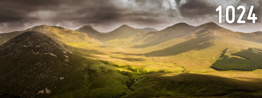
Hero Image

Title
Title
Title
Title
Title
Title
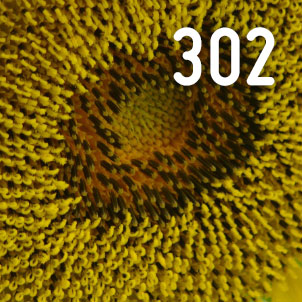
-w syntaxHere we have three types of images. A hero, a rectangular image and a square image. At smallest size, all images – even the square – are presented as rectangles. This necessitates forcing source selection at sizes, aka art direction. However, we will allow the browser to cache larger images if need be, yet if no images are cached then to pick the closest match.
Further adding complexity is a fixed sidebar at larger sizes, which the images need to adapt to. To keep gutters simple, they are set to 3vw at all sizes. Depending on the breakpoint, this is multiplied 3 or 5 times because there are 3 or 5 gutters (simple, yes?). It is likely in a true real-world scenario that this value would change (eg. capping at the lower and upper bounds). The sidebar, which without any CSS affecting the rem unit is 17.5em wide, itself affects the hero and other images as well. This results in the rather lengthy and maths-heavy source list for each.
It is also likely that, unles in exceptional circumstance, you would want to consider automating generation of the <picture> tags and related scaled images.
For the rectangular and hero images, we can optimise them slightly if we don’t care about forcing a particular source by just using straight image srcset with -w syntax. The square image, which at small sizes becomes rectangular, requires art direction and hence the <picture> tag.
Using the -w syntax and <source> tags is really complicated in this scenario by the fixed width sidebar which must be calcuated for, along with the gutters. Ironically, the simplest caching method (grab a large size, hold on to it) ends up with this mathematically complex source for selecting the right initial size to load.
The extra source stuff on the square image tag itself is more to handle a fallback in case the actual <picture>> tag was unsupported but -w syntax was.
Important note: Any em or rem units used in the <source> are calculated before any other CSS has loaded, so assume 1rem = 16px. This is why the sidebar is 17.5em wide and not 28rem even though this page uses a multiplier to make 1rem = 10px.
					Hero:
					<img src="img-hero-m.jpg"
					     srcset="img-hero-xl.jpg 1920w,
					             img-hero-l.jpg  1600w,
					             img-hero-m.jpg  1024w,
					             img-hero-s.jpg  560w"
					     sizes="(min-width: 60em) calc(100vw - 17.5em),
					            100vw">

					Rectangular block:
					<img src="img-re-m.jpg"
					     srcset="img-re-l.jpg 980w,
					             img-re-m.jpg 660w,
					             img-re-s.jpg 395w"
					     sizes="(min-width: 80em) calc((100vw - (5 * 3vw) - 17.5em) / 2),
					            (min-width: 60em) calc( 100vw - (3 * 3vw) - 17.5em),
					            (min-width: 40em) calc((100vw - (5 * 3vw) - 17.5em) / 2),
					            calc(100vw - (3 * 3vw))">

					Square block:
					<picture>
					    <source media="(min-width: 30em)"
					            srcset="img-sq-l.jpg 448w,
					                    img-sq-m.jpg 302w,
					                    img-sq-s.jpg 180w"
					            sizes="(min-width: 80em) calc((100vw - (5 * 3vw) - 17.5em) / 4),
					                   (min-width: 60em) calc((100vw - (3 * 3vw) - 17.5em) / 2),
					                   (min-width: 40em) calc((100vw - (5 * 3vw)) / 4),
					                   calc((100vw - (3 * 3vw)) / 2)">
					    <source srcset="img-re-l.jpg 980w,
					                    img-re-m.jpg 660w,
					                    img-re-s.jpg 395w"
					            sizes="100vw">
					    <img src="img-sq-m.jpg"
					         srcset="img-sq-l.jpg 448w,
					                 img-sq-m.jpg 302w,
					                 img-sq-s.jpg 180w"
					         sizes="(min-width: 80em) calc((100vw - (5 * 3vw) - 17.5em) / 4),
					                (min-width: 60em) calc((100vw - (3 * 3vw) - 17.5em) / 2),
					                (min-width: 40em) calc((100vw - (5 * 3vw)) / 4),
					                calc((100vw - (3 * 3vw)) / 2)">
					</picture>
Hero Image
Title
Title
Title
Title
Title
Title
 Chrome 46
 Firefox 42
 Safari 9 Edge 12 Edge 13 Android Chrome 44 iOS Safari 9