Hero Image
Title
Title
Title
Title
Title
Title
-x syntaxHere we have three types of images. A hero, a rectangular image and a square image. At smallest size, all images – even the square – are presented as rectangles. This necessitates forcing source selection at sizes, aka art direction. It may also, for reasons of visual quality, be desirable to ensure the best fitting image.
For reasons of avoiding caching issues, ?em=xx queries are used to make each size “unique”. If this was not done, varying different larger images may be used when not desired.
Further adding complexity is a fixed sidebar at larger sizes, which the images need to adapt to. To keep gutters simple, they are set to 3vw at all sizes. It is likely in a true real-world scenario that this value would change (eg. capping at the lower and upper bounds). The sidebar affects the hero and other images as well, resulting in the rather lengthy source list for each.
It is also likely that, unles in exceptional circumstance, you would want to consider automating generation of the <picture> tags and related scaled images.
Using the -x syntax and <source> tags ensures that an appropriate image is chosen for each breakpoint. The last <source> does not have a media query specified, to handle all remaining small size displays.
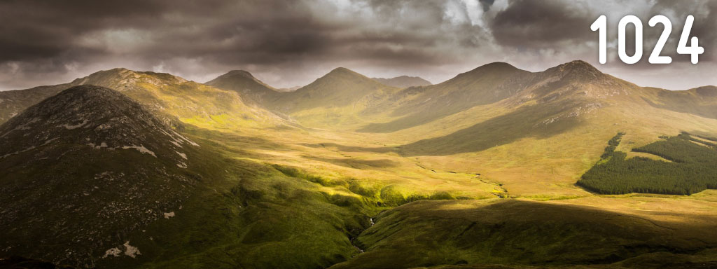
Hero:
<picture>
<source media="(min-width: 80em)"
srcset="img-hero-l.jpg?em=80 1x,
img-hero-xl.jpg?em=80 2x">
<source media="(min-width: 40em)"
srcset="img-hero-m.jpg?em=40 1x,
img-hero-l.jpg?em=40 2x">
<source srcset="img-hero-s.jpg?em=20 1x,
img-hero-m.jpg?em=20 2x">
<img src="img-hero-m.jpg"
srcset="img-hero-m.jpg 1x,
img-hero-l.jpg 2x">
</picture>
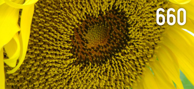
Rectangular block:
<picture>
<source media="(min-width: 80em)"
srcset="img-re-s.jpg?em=80 1x,
img-re-m.jpg?em=80 2x">
<source media="(min-width: 60em)"
srcset="img-re-m.jpg?em=60 1x,
img-re-l.jpg?em=60 2x">
<source media="(min-width: 40em)"
srcset="img-re-s.jpg?em=40 1x,
img-re-m.jpg?em=40 2x">
<source media="(min-width: 30em)"
srcset="img-re-m.jpg?em=30 1x,
img-re-l.jpg?em=30 2x">
<source srcset="img-re-s.jpg?em=20 1x,
img-re-m.jpg?em=20 2x">
<img src="img-re-m.jpg"
srcset="img-re-m.jpg 1x,
img-re-l.jpg 2x">
</picture>
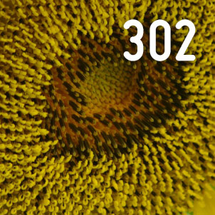
Square block:
<picture>
<source media="(min-width: 80em)"
srcset="img-sq-s.jpg?em=80 1x,
img-sq-m.jpg?em=80 2x">
<source media="(min-width: 60em)"
srcset="img-sq-m.jpg?em=60 1x,
img-sq-l.jpg?em=60 2x">
<source media="(min-width: 40em)"
srcset="img-sq-s.jpg?em=40 1x,
img-sq-m.jpg?em=40 2x">
<source media="(min-width: 30em)"
srcset="img-sq-m.jpg?em=30 1x,
img-sq-l.jpg?em=30 2x">
<source srcset="img-re-s.jpg?em=20 1x,
img-re-m.jpg?em=20 2x">
<img src="img-sq-m.jpg"
srcset="img-sq-m.jpg 1x,
img-sq-l.jpg 2x">
</picture>
Hero Image
Title
Title
Title
Title
Title
Title
 Chrome 46 Firefox 42
 Safari 9 Edge 12 Edge 13 Android Chrome 44 iOS Safari 9
Images from Pixabay – Hero: Mountain valleys – Other: Sunflower bloom. Used under a Creative Commons licence.