<picture> patterns

Simple art direction changes

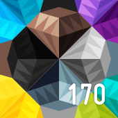
Here we combine the two syntaxes. At small sizes, a square image will be shown. At larger images, a rectangular image will be shown. The swap between these two is enforced by the use of <picture> and <source> elements with media attributes.

As has been seen in the plain -x and -w syntax examples, larger images may be cached and used, even when the window is scaled down again.

Source:


					<picture>
					    <source media="(min-width: 50em)"
					            srcset="img-1920.png 1920w,
					                    img-1280.png 1280w,
					                    img-960.png   960w,
					                    img-640.png   640w,
					                    img-480.png   480w,
					                    img-320.png   320w"
					            sizes="50vw">
					    <source srcset="img-c-170.png 1x,
					                    img-c-340.png 2x">
					    <img src="img-c-170.png">
					</picture>
				

Browser support

Warning Chrome 46
Buggy. If you refresh at the first source breakpoint, it gets stuck on an image source. If you trigger the second source, it picks up again. Given the srcset -w and sizes behaviour from other examples has it using the largest cached source, instead here it changes sources up and down, rather than holding on to the largest one.
Warning Firefox 42
Buggy. Especially with srcset on an <img> tag. Given the srcset -w and sizes behaviour from other examples has it using the largest cached source, instead here it changes sources up and down, rather than holding on to the largest one.
Fail Safari 9
No <picture> support.
Fail Edge 12
No <picture> support.
Pass Edge 13
Pass Android Chrome 44
Appears to work, but may still have similar issues as desktop Chrome were the conditions correct.
Fail iOS Safari 9
No <picture> support.

« Back to <picture> patterns